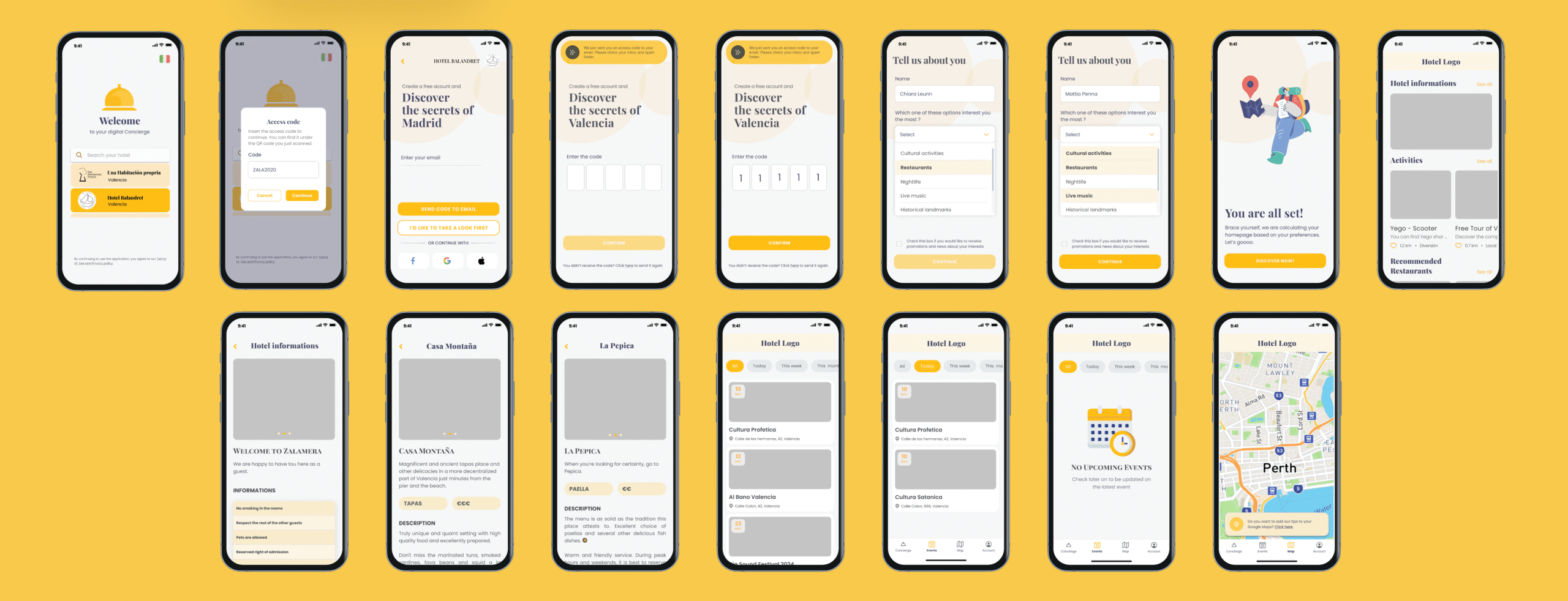
Concierge App
Redesigning Hospitality: Crafting a Seamless Concierge Experience
Overview
Role:
UX UI Design
Timeline:
8 weeks -400+ hours
Client:
Concierge
Tools used:
Figma
Context
Concierge is a mobile application designed for 3-star hotel guests, providing access to hotel information, restaurant and taxi reservations, tourist recommendations, and city transport details. I joined the project to lead a complete redesign of the existing app, addressing usability issues, visual consistency, and feature discoverability. My work involved analyzing user feedback, heatmap data, and the old interface to identify key pain points and transform the user experience.
Task
- Conducted research through hotel guest reviews, feedback forms, and behavioral heatmaps to detect usability gaps;
- Defined user personas and problem statements based on qualitative and quantitative data;
- Created improved user flows and reorganized navigation to increase feature discoverability;
- Developed wireframes and final UI designs with a clear hierarchy and visual system aligned with the brand;
- Delivered a modern, intuitive interface that improves onboarding and encourages exploration of the app’s services.
Process
I.Empathize
II.Define
III. Ideate
IV. Results
Empathize
Overview
Research
Costumer Interviews
Research
Methods used:
- UX Audit of the existing app to map pain points in navigation, layout, and visual clarity.
- Stakeholder interviews to align on business goals, key metrics, and perceived UX issues.
- User feedback review based on existing reviews and app store comments.
- Competitive analysis of relevant travel and concierge platforms to identify UX patterns, opportunities, and gaps.
These findings directly informed my decisions around information hierarchy, onboarding flow, and UI system redesign — ensuring that improvements weren’t just visual, but strategically aligned with user needs.
Benchmarking
To better understand the market and user expectations, I conducted a benchmarking study of leading concierge and companion service apps. I analyzed Passported, Hi Jiffy, Duve, and other similar apps, focusing on:
- Key features and differentiators;
- User experience and ease of use;
- Visual design and consistency;
- Strengths and areas for improvement;
This study allowed me to define clear criteria for the design of Concierge Friend, ensuring the app delivers an intuitive, attractive, and competitive user experience.
Competitor
Strong Points
Pain Points
Opportunities for Concierge
· Strong customization & branding · Real-time analytics & feedback
· Steep learning curve for staff & guests
· Simpler setup and PMD integrations
· Automated guest communication & FAQs
· Relies on other systems for check-in
· Build a full concierge within the chat UX
· Increases revenue & efficiency
· Strong PMS integrations
· Risk of generic experience across properties
· Build a more personal ¬ non-intrusive mobile UX
· Offer feedback via video/audio
· Designed for mobile travelers
· Limited data & user insights
· Create seamless pre/during/post trip communication flow
Costumer Interviews
Due to limited direct access to users, insights were gathered from online hotel reviews and a short feedback form provided to guests. To complement this qualitative input, heatmap analytics were reviewed to identify interaction patterns within the old app. This combination of user sentiment and behavioral data offered a clear view of the app’s usability issues, highlighting confusion points and underused features.
Conclusions
Key Finding #1: Prioritize Simplicity Over Feature Overload
Current competitors overwhelm both guests and hotel staff with complex interfaces and excessive features. Concierge Friend can stand out by offering a streamlined, intuitive platform that requires minimal setup for hoteliers and enables guests to find what they need in just a few taps.
Key Finding #2: Design for Emotional Trust and Visual Delight
Aesthetic quality directly impacts trust and engagement. Users repeatedly emphasized that a product that “looks good and feels personal” is more likely to be used. Concierge Friend should focus on delivering a visually elegant and emotionally engaging experience that builds confidence and enhances the feeling of hospitality.
I.Empathize
II.Define
III. Ideate
IV. Results
Define
Overview
Persona
Problem Statements
Persona
From the research and interview findings, I created a detailed user persona that represents our primary target audience. This persona served as a constant reference point throughout the design process, ensuring that every decision aligned with user motivations, goals, and pain points.
From research, two major insights emerged: the user’s primary motivation is to make the most of their time in an unfamiliar city without friction; and their main need is to quickly access relevant, trustworthy information and services related to their hotel and surroundings.
These findings were fundamental to shaping the user persona and became a cornerstone of the design process.
Problem Statements
Based on the collected insights and usability analysis of the old app, several key problems were identified:
I.Unclear Navigation and Iconography – The main screen presented multiple icons without labels, making it difficult for users to understand the purpose of each category.
II.Lack of Information Hierarchy – Categories such as “Offers” and “Events” had identical layouts, which led to confusion and reduced engagement.
III.Weak Onboarding Experience – The app opened directly to the main screen without any introduction or guidance, leaving new users without context.
IV.Limited Visual and Brand Identity – The design lacked a clear visual system, which affected trust and user motivation to explore.
V.Low Feature Discoverability – Many available services were not obvious to the user, resulting in underutilization of the app’s core functionalities.
I.Empathize
II.Define
III. Ideate
IV. Results
Ideate Overview
User-Flow
User-Flow
I.Empathize
II.Define
III. Ideate
IV. Results
Results
Overview
Low Fidelity Wireframes
At this stage, my goal is not just to structure screens, but to translate business and user needs into functional, clear, and scalable solutions.
I usually start with hand-drawn wireframes to quickly explore ideas, flows, and layouts before moving into digital formats.
High Fidelity Wireframes
I work with low- and mid-fidelity wireframes to:
- Validate flows and hierarchies before moving into visual design;
- Identify bottlenecks or friction points early on;
- Communicate effectively with cross-functional teams (product, development, stakeholders);
- Ensure that every element on screen serves a clear purpose
Final Design
Overview
Core UI
To establish the visual structure and key components of the interface, ensuring that the guest’s interaction with the digital concierge is intuitive, frictionless, and aligned with the expectations of modern hospitality experiences.
I. Clarity & Readability: The interface prioritizes clean, legible design to support guests of all ages and levels of digital fluency.
II.Clear Visual Hierarchy: Layouts follow mobile-first visual reading patterns (Z or F-patterns), with prominent action buttons and fixed navigation for ease of repeat use.
III.Component Consistency: All elements follow a cohesive design system — including color, typography, buttons, and cards — reflecting the brand identity of the hotel or hospitality group.
IV. Accessibility: Adequate color contrast, large tap targets, and inclusive design considerations allow for comfortable use by guests with varying needs or limitations.
Visuals
Tone of voice: Professional, warm, and discreetly luxurious.
Visual style: Clean, minimal, soft color palette with illustrative icons — inspired by Scandinavian design and luxury tech.

