

Cirque de Jari
Designing a Visual Identity that Embodies Strength and Femininity
Overview
Graphic Design
12 weeks – 180+ hours
Client:
Cirque de Jari
Tools used:
Photoshop, Illustrator, WordPress, Figma
Brief
Client
Cirque de Jari is an artisanal jewelry brand that conveys strength, nature, sobriety, and femininity. Inspired by a vibrant, almost circus-like universe where resilient women transform the everyday into authentic beauty, the brand draws from rich pigments and natural materials to tell stories of empowerment and delicacy.
Challenge
Create a brand identity that balances strength and delicacy, communicating artisanal authenticity and contemporary sophistication. Differentiate the brand in a saturated market by avoiding clichés and connecting emotionally with women seeking meaningful, soulful pieces.
Solution
- Develop a strong concept based on balanced contrasts of vibrant and sober colors, organic forms, and clean layouts.
- Define a color palette conveying vitality, passion, serenity, and sophistication.
- Establish an approachable, emotive, and empowering brand voice.
- Lead art direction across photography, textures, and materials to reflect the brand’s artisanal, natural essence.
- Create versatile visual applications for packaging, web, social media, and promotional materials.
Objectives
- Position Cirque de Jari as a distinctive artisanal jewelry brand recognized for its strong visual identity and emotional storytelling.
- Build a coherent, memorable brand experience that resonates with women valuing authenticity and creativity.
- Ensure consistent visual and verbal application across all brand touchpoints.
Style & Impact
Natural yet sophisticated visuals; a warm palette with vibrant contrasts; elegant, humanized typography; photography that conveys texture, tactility, and emotion. The identity inspires trust, emotional exclusivity, and a sense of resilient, creative female community.
Creative Process
I.Reseach
II.Concept
III.Exploration
IV.Outcome
Research
Overview
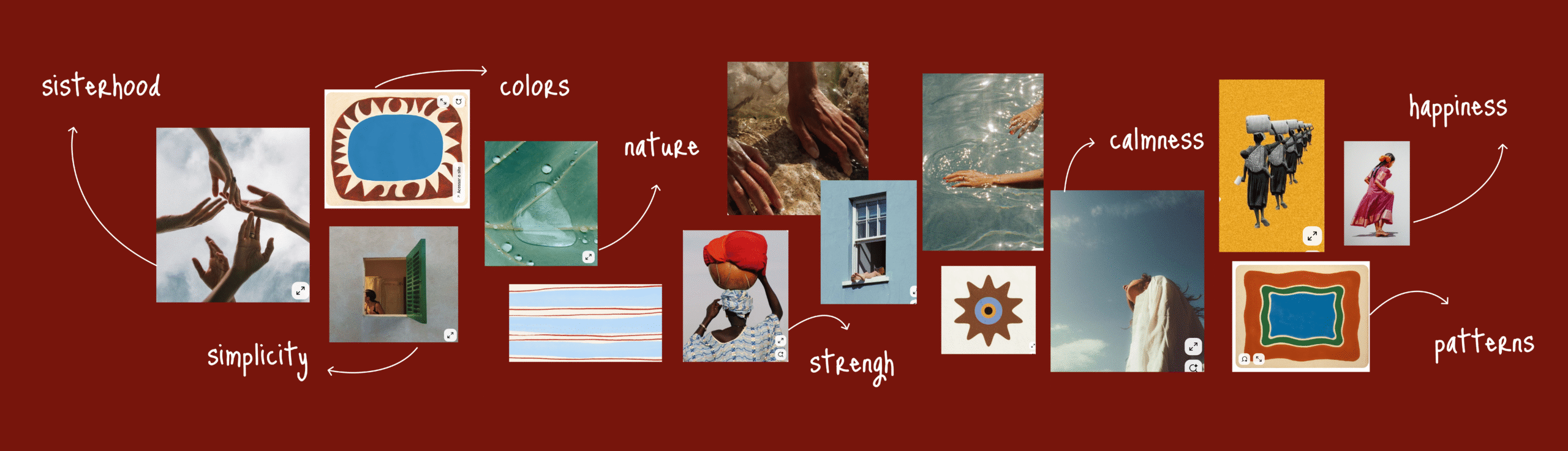
Moodboard
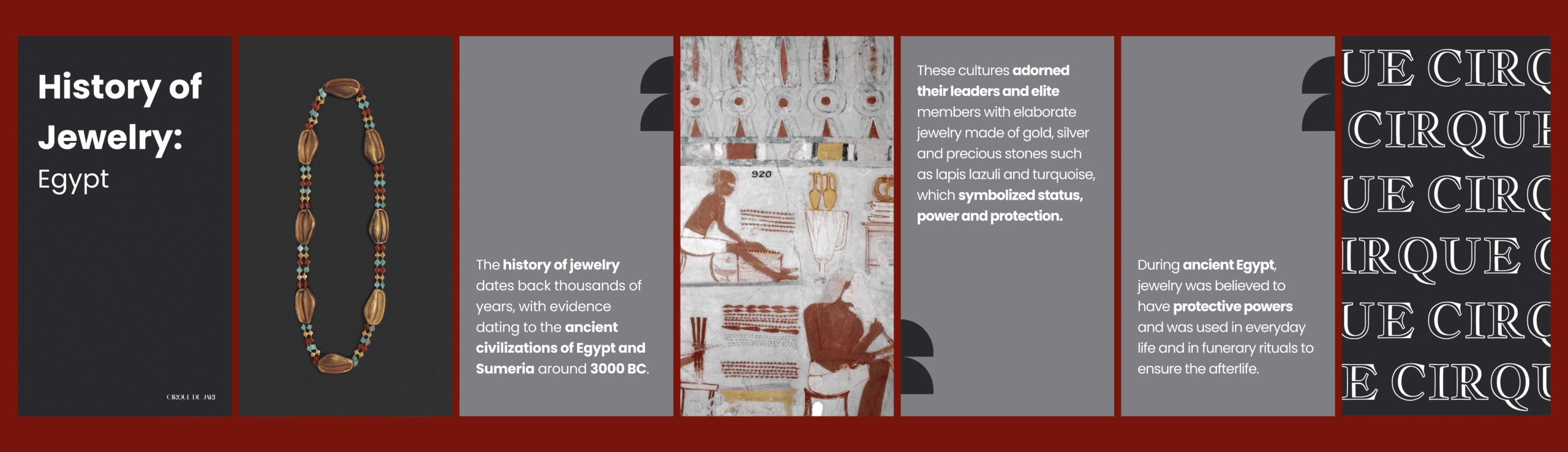
The research process was essential to establishing the conceptual and visual foundations of the brand. Through the analysis of the client and its context, the core values of Cirque de Jari were defined: strength, femininity, sobriety, and a strong connection to nature.
A study of the market and contemporary artisanal jewelry brands was carried out to identify recurring aesthetic patterns and spot opportunities for differentiation. In parallel, audience profiles were explored to understand their emotional and aesthetic motivations, allowing the identity to align with the expectations of an audience that values authenticity, creativity, and meaningful visual narratives.
As part of this process, graphic and cultural references were collected, ranging from natural pigments and materials to the visual metaphor of the circus universe as a vibrant and poetic space. One of the key outcomes of the research was the development of a visual map in the form of a moodboard, which synthesized the findings and served as an aesthetic and conceptual guide for the project’s art direction.
I.Reseach
II.Concept
III.Exploration
IV.Outcome
Concept Overview
Core Idea
A brand that blends strength and delicacy through a visual language inspired by nature and pigments, representing resilient women who transform their surroundings into authentic and emotional beauty.
Naming
The name combines “Cirque” (a vibrant, chaotic world) and “Jari” (a fictional figure with roots in Eastern culture and colorful natural pigments), creating a memorable name that balances structure and fluidity, generating visual and narrative contrasts.
Visual Direction
The guiding concept is built on the duality between strength and delicacy, expressed through a visual language inspired by nature and the richness of pigments. The brand embodies resilient women who transform their surroundings into authentic, emotional beauty.
- Overall Style: Organic Elegance – an aesthetic that combines vitality with subtlety, conveying sophistication without rigidity.
- Visual Language: minimal yet vibrant compositions, relying on carefully curated imagery without illustrations, to maintain a contemporary and straightforward tone.
- Color Palette: a spectrum of contrasts that balances vitality and warmth with strength and passion, while introducing sobriety, calm, sophistication, and depth.
- Typography: For the Logo, an elegant, feminine typeface with organic nuances, avoiding the stiffness of overly formal designs. As for the Body text: a sans serif typeface, approachable and highly legible, reinforcing accessibility and emotional connection.
Together, the visual direction establishes an identity that balances the expressiveness of the natural with the clarity of the contemporary, delivering a coherent and authentic visual language that resonates emotionally with its audience.
Personality
Feminine but without clichés, natural and sophisticated, with a visual storytelling voice that gives the brand authenticity and memorability, combining craftsmanship with emotional luxury.
I.Reseach
II.Concept
III.Exploration
IV.Outcome
Exploration
Overview
Critical Thinking
Design Variations
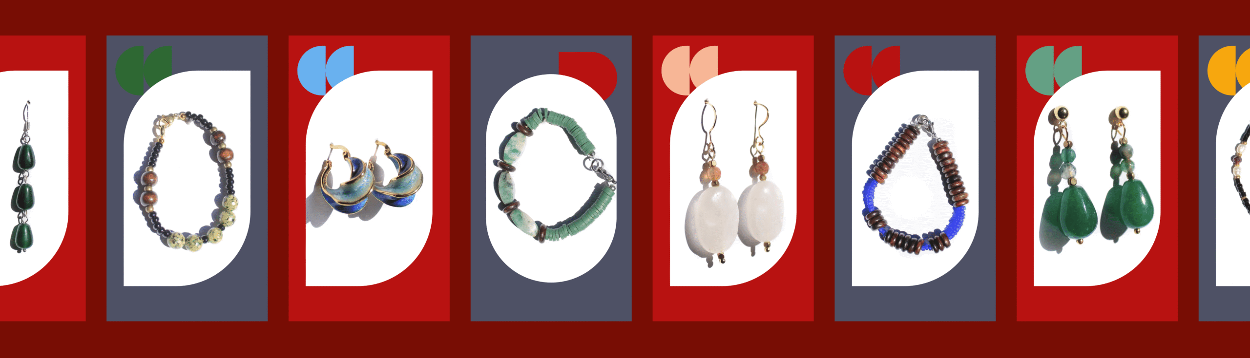
During this phase, multiple design variations were developed to capture the unique essence of Cirque de Jari. Some of the directions explored include:
- Elegant Minimalism: Designs emphasizing simplicity and sophistication, using clean lines and geometric forms to highlight the intrinsic beauty of the jewelry.
- Circus Inspiration: Visual elements inspired by the circus, such as tents, juggling, and figures in motion, were subtly integrated into typography, patterns, and brand icons, creating a playful and unique identity that connects with the narrative of the Cirque de Jari name.
Critical Thinking
During the exploration of variations, it became evident that excessive use of circus motifs could undermine the brand’s credibility and give it an overly childish tone. Therefore, a delicate balance was sought to capture the magic of the circus world—full of creativity and positive energy—without venturing into its more literal or caricatured aspects. Carefully selected elements representing this universe were incorporated subtly in the color palette and small details, ensuring the visual identity conveyed sophistication, theatricality, and authenticity.
It was also essential to reflect the femininity of the brand through elegant lines, as well as maintain simplicity with a coherent, clear, and impactful brand execution. Each design decision was critically assessed to ensure consistency between voice, tone, and visual presence, establishing an identity that communicates confidence, exclusivity, and a distinctive touch of magic.
I.Reseach
II.Concept
III.Exploration
IV.Outcome
Outcome
Overview
Logo
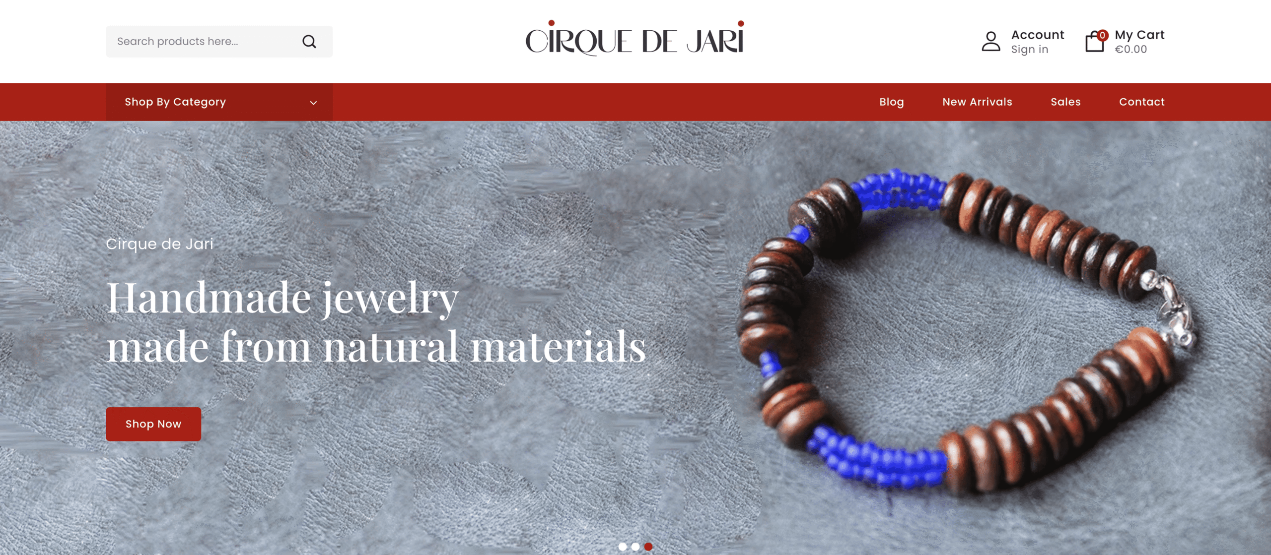
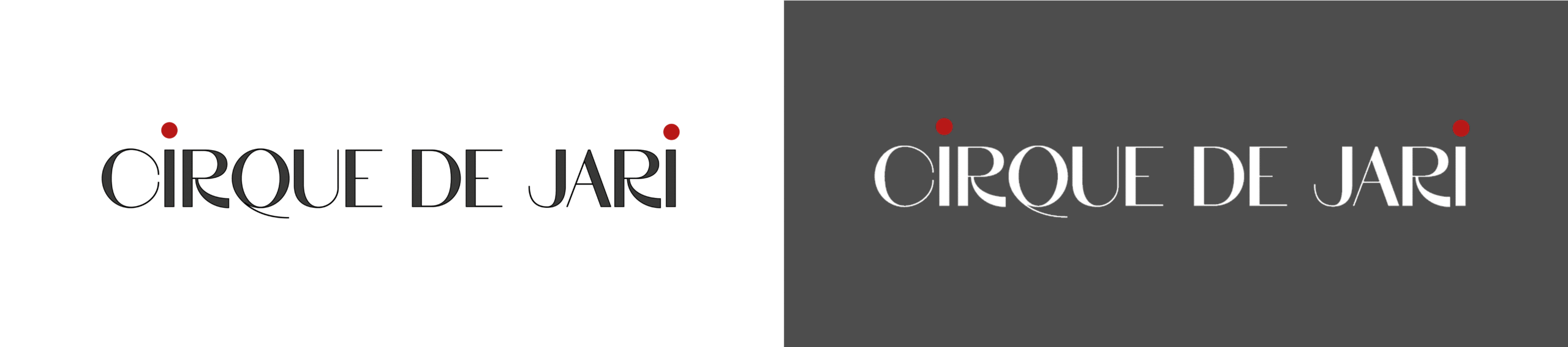
The Cirque de Jari logo was conceived as the cornerstone of the brand’s identity, a visual emblem that encapsulates its essence and sets the tone for the entire creative system. Designed to merge spectacle with sophistication, it balances delicate femininity with an undercurrent of strength and resilience. The refined lines and subtle details convey elegance and delicacy, while its bold structure ensures presence and memorability. More than a symbol, the logo acts as the central piece of the branding, anchoring the art direction, typography, and visual language that follow. It embodies Cirque de Jari’s core values—strength, femininity, and grace—while serving as the guiding element that unifies the brand across every touchpoint.
Typography
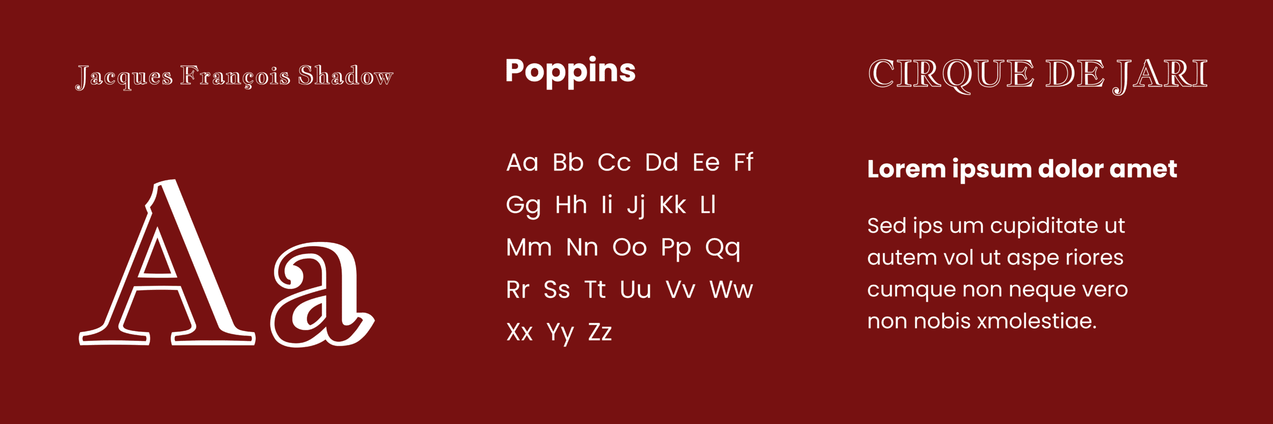
The typographic choices create a dual voice for the brand. Poppins provides clarity, scalability, and digital flexibility, serving as the foundation across social and web applications. In contrast, Jacques François Shadow appears sparingly as a display accent, introducing a sense of theatricality and visual surprise. Together, they establish a dynamic rhythm between modern precision and expressive character.
Colors
The color palette mixes a warm mustard yellow that brings vitality and warmth, an intense red symbolizing strength and passion, a light beige that balances with sobriety and calm, and a dark gray that adds sophistication and depth.

Branding Material
Forms are organic and asymmetric, with textures evoking craftsmanship, combined with clean layouts and well-spaced compositions that maintain elegance and sophistication.