Casas Elilula

Expanding an eco-chic retreat’s reach through refined, nature-inspired brand materials

Overview

Role: Graphic Design

Timeline: 4 weeks – 160 + hours
Client: Casas Elilula

Tools used: Photoshop, Illustrator, Indesgin, Figma


Brief

Client
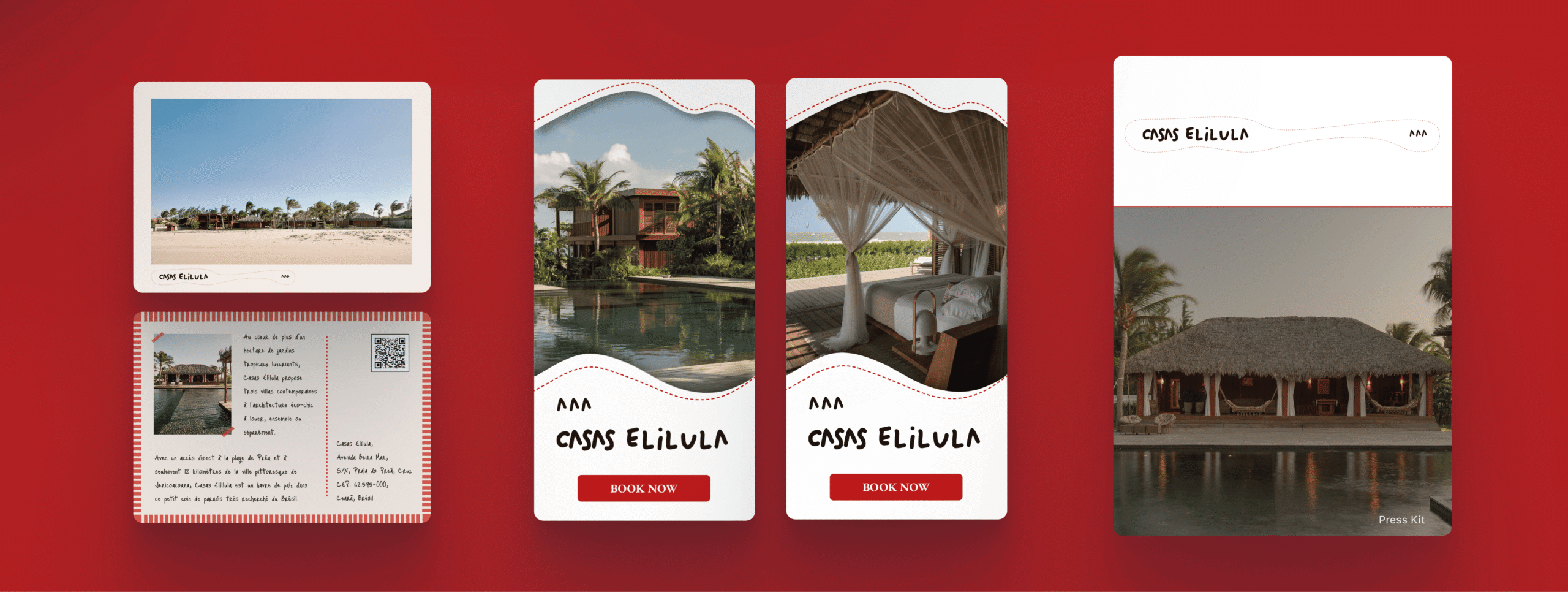
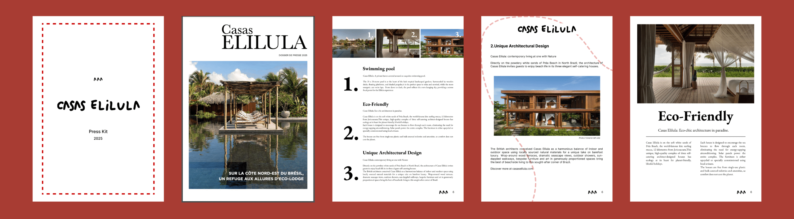
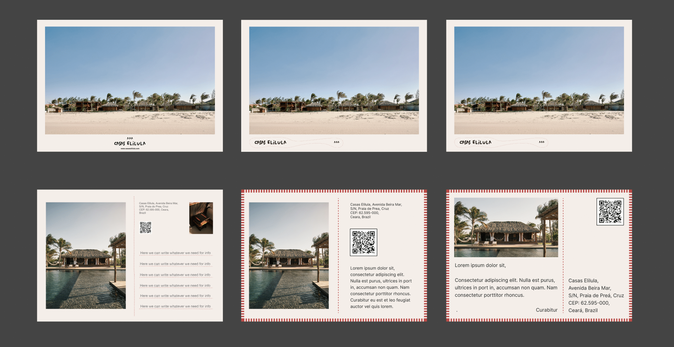
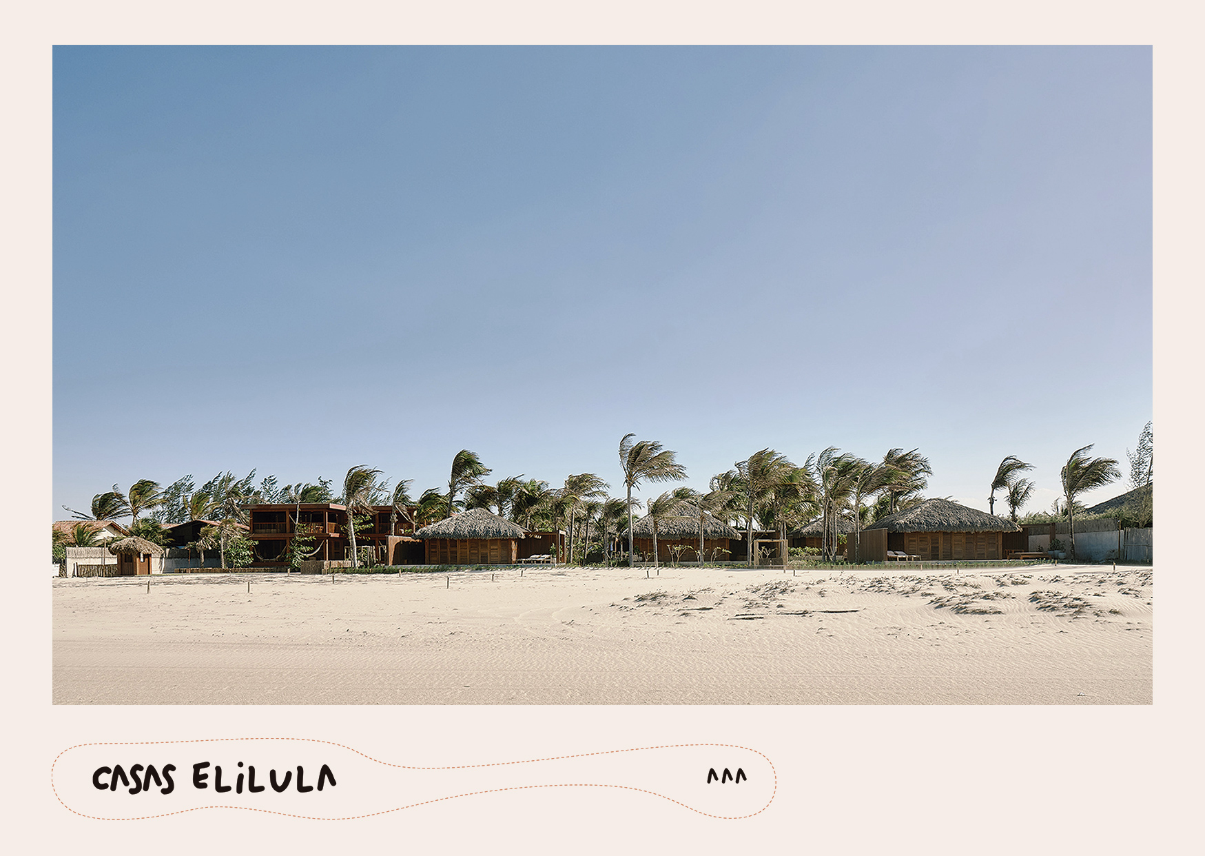
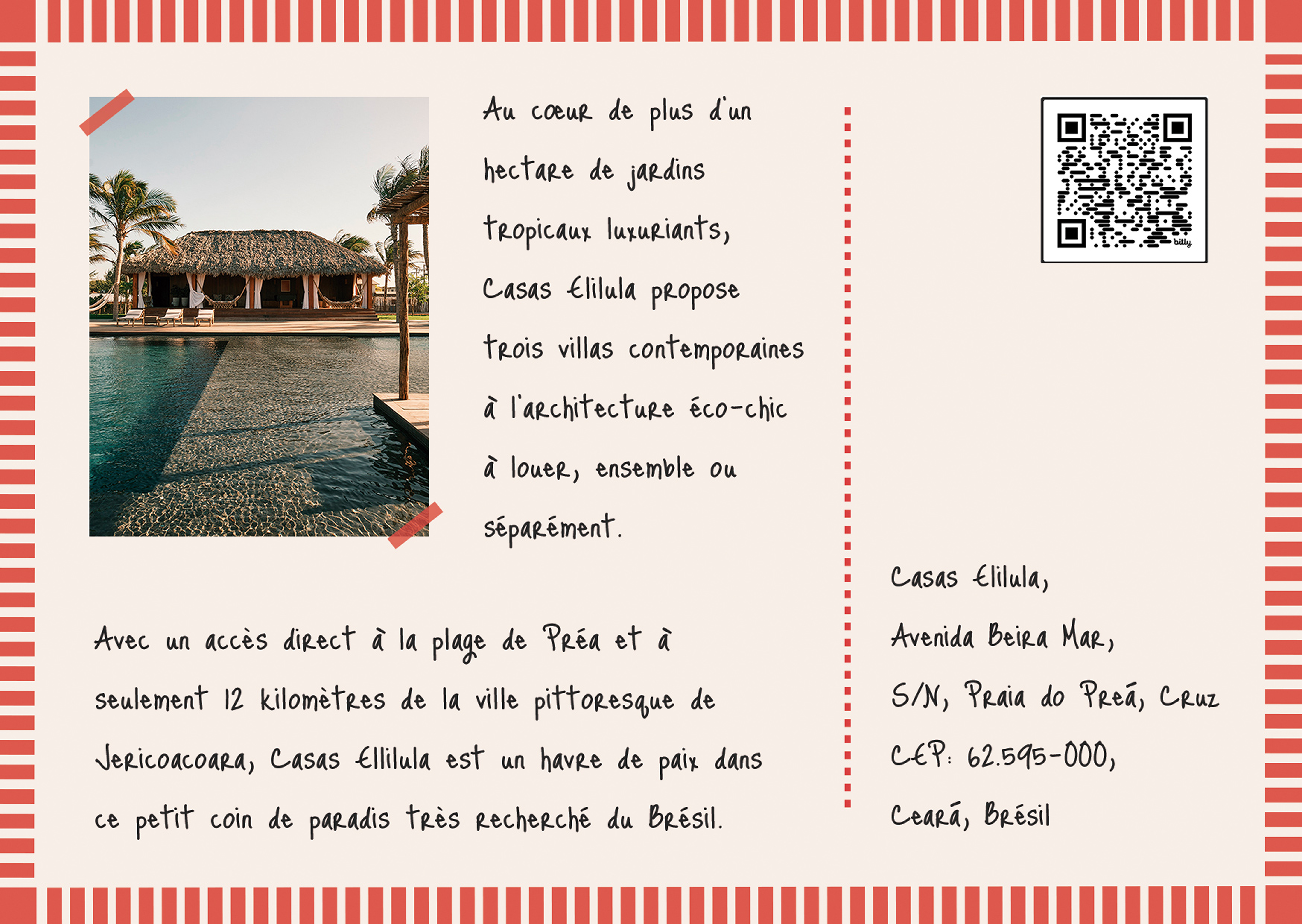
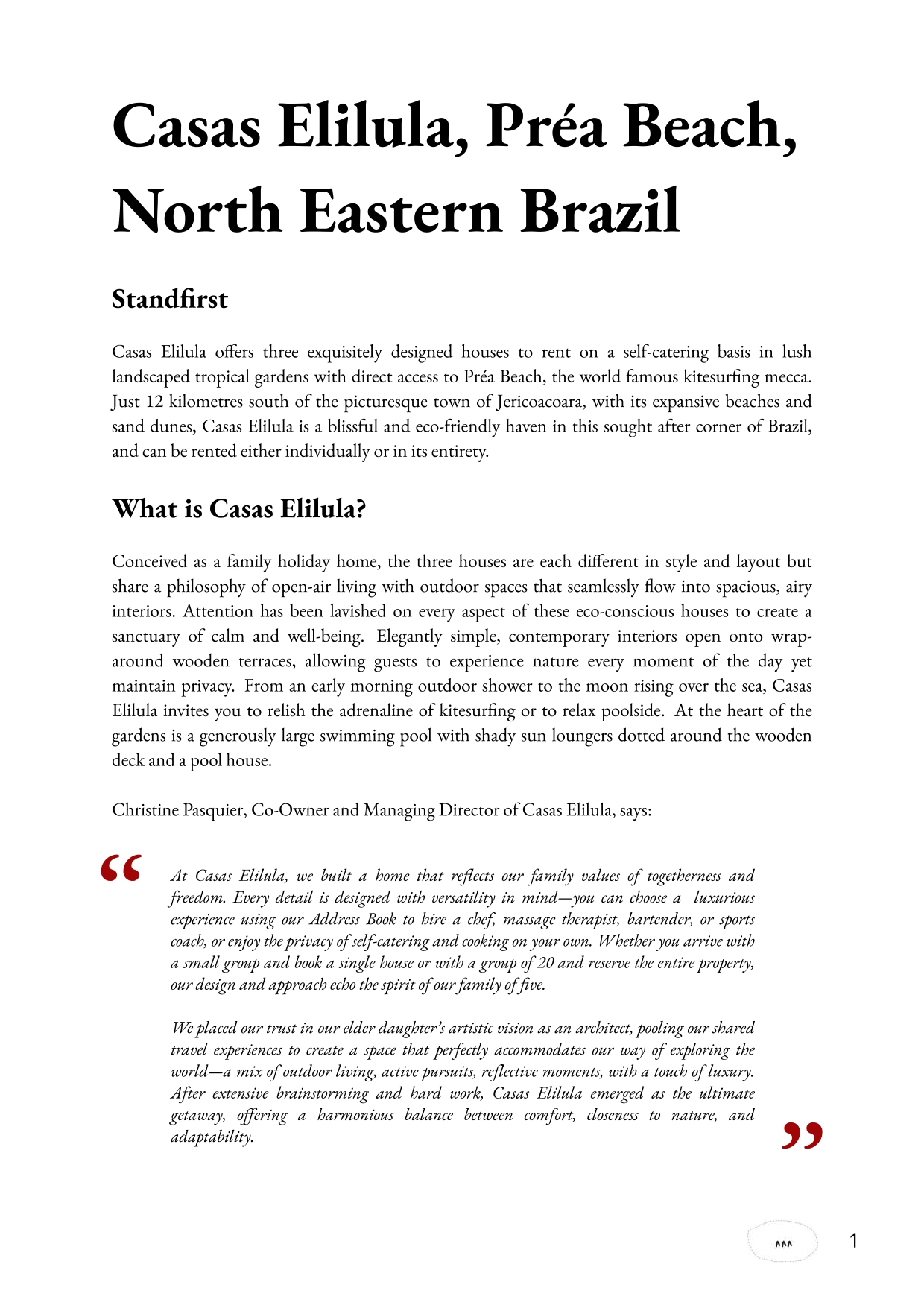
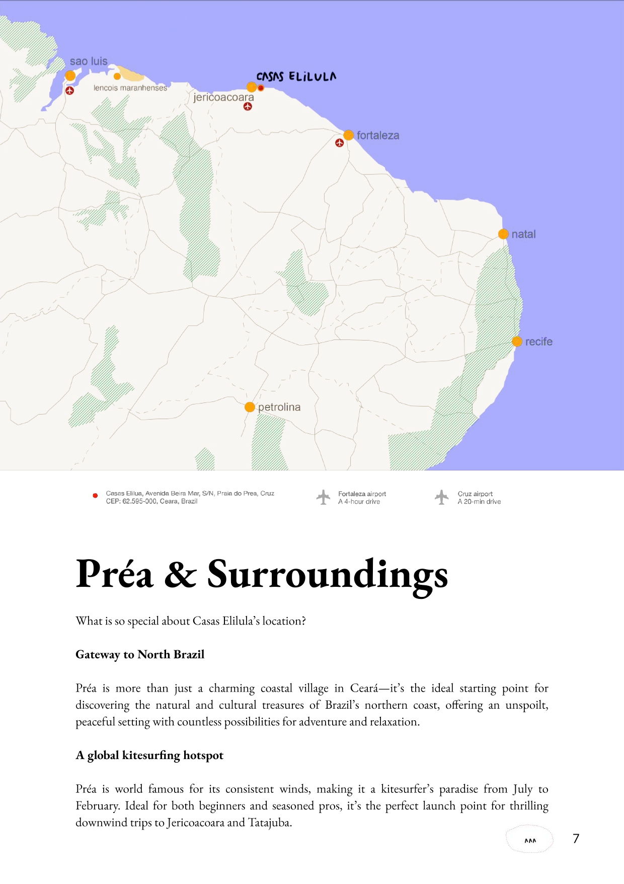
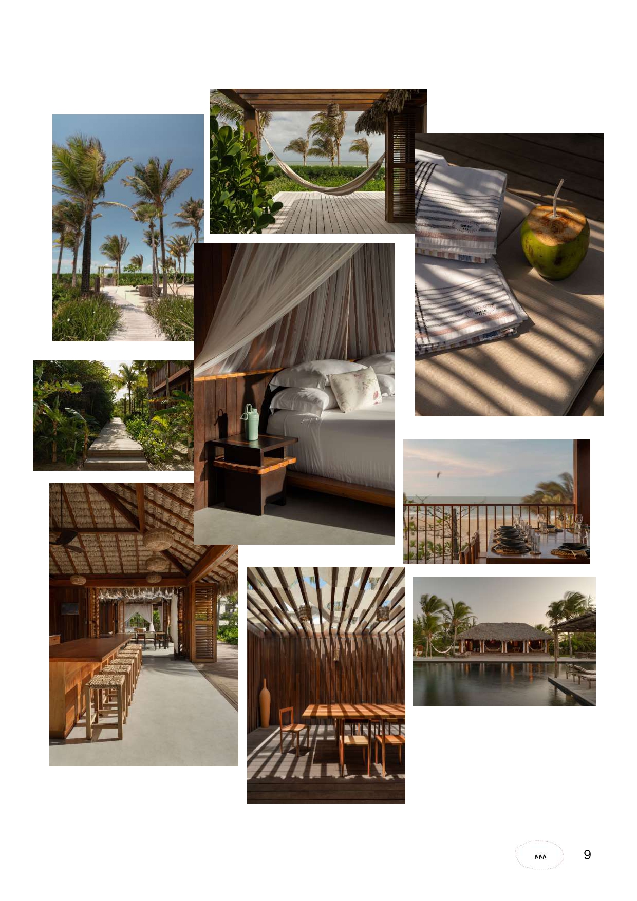
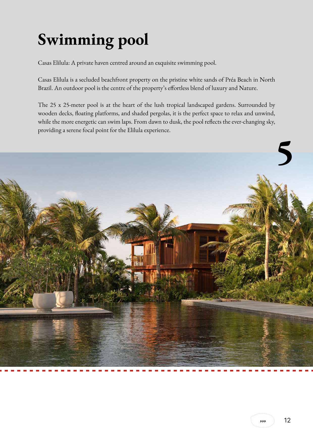
Casas Elilula, an eco-chic vacation complex in Praia do Preá, Brazil, composed of three unique houses designed with sustainable materials and surrounded by lush nature.


Challenge
Expand their audience through graphic materials that convey the essence of the place: sustainable design, natural beauty, and a relaxing experience.


Solution
Design of web banners, a postcard, and a press kit with a serene and elegant aesthetic inspired by Casas Elilula’s architecture and natural surroundings.


Objectives

  • Increase digital visibility.
  • Create an emotional connection with potential visitors.
  • Professionalize institutional communication.
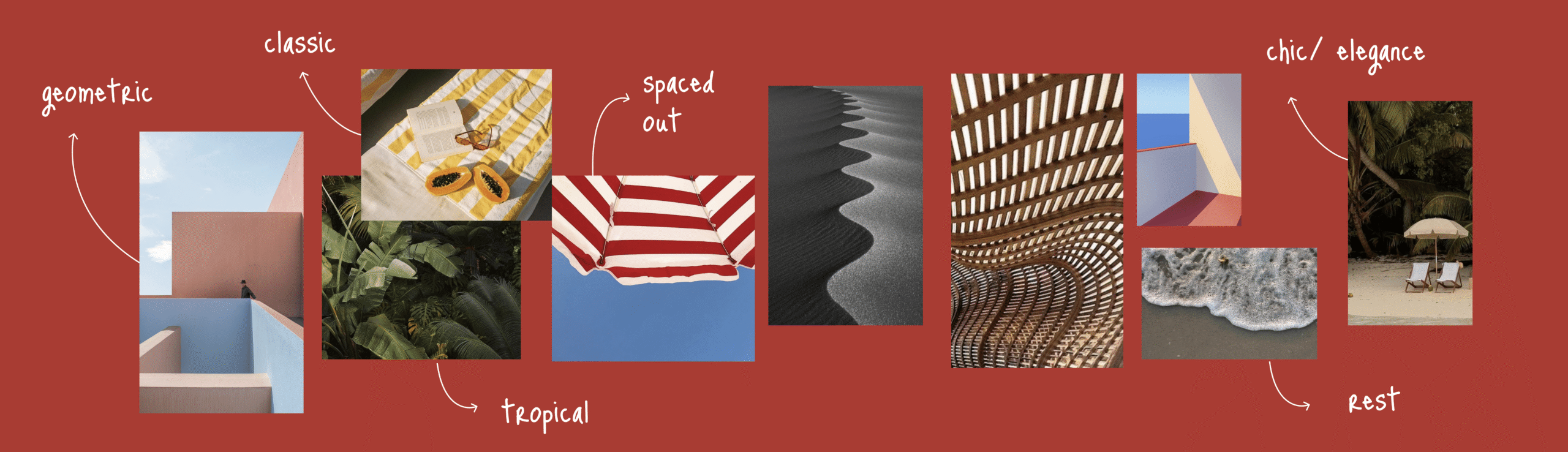
Style 
Natural, minimalist, and aligned with the brand’s eco-chic identity.


Expected Impact
Higher website conversion, stronger brand recall, and improved positioning with media and collaborators.

Creative Process
I.Reseach
II.Concept
III. Exploration
IV. Outcome

Research

Overview

Moodboard

Moodboard

To establish a strong creative direction, we began by gathering visual references, cultural cues, and market trends relevant to the brand’s identity. The resulting moodboard served as a visual compass, aligning the aesthetic vision with the brand’s values and target audience.

I.Reseach
II.Concept
III. Exploration
IV. Outcome

Concept

Overview

Visual Direction


Visual Direction

I took the brand’s existing visual identity as inspiration, drawing from its symbolic elements. The nodes reference the cardinal lines of a map, while the carets (^) explore the presence of the three distinct houses. This simplicity in representation was also reflected in our materials, ensuring they conveyed the brand’s core characteristics: a sense of direction, connection to place, and a refined, minimal aesthetic.

I.Reseach
II.Concept
III. Exploration
IV. Outcome

Exploration

Overview

Design Variations


Design Variations

This stage combines strategic thinking with visual exploration, bridging the rationale behind each design choice and the development of multiple creative directions. It reflects both the analytical process that guided the project and the visual iterations that shaped the final outcome. Here you can see some os the visual exploration that were part of this process:

I.Reseach
II.Concept
III. Exploration
IV. Outcome

Outcome Overview

Postal Card
Press Kit

Post Card

The concept was designed to evoke memorable holidays, an intimate and authentic retreat, while reflecting the brand’s refined aesthetic. The dotted border, inspired by vintage postcards, connects directly to the idea of correspondence and cherished travel memories, inviting viewers to imagine themselves writing from paradise. Handwritten typography reinforces this narrative, adding warmth and a personal touch, as if the message came from a friend recommending a special place.


On the reverse, minimalism was key to balancing the composition. Clean, well-structured space highlights essential information without overwhelming, conveying the serenity of the Casas Elilula experience. This simplicity, paired with artisanal graphic elements, enhances the sense of exclusivity and attention to detail.


The entire designs were developed in harmony with the existing brand identity, ensuring coherence and continuity while building a bridge between the audience and the unique experience the property offers.

Press Kit

The development of the press kit for Casas Elilula was guided by a clear premise: to communicate the essence of the project in a direct and elegant way, while respecting the brand’s minimalist identity. The client requested straightforward material, free of unnecessary interruptions, allowing the images and information to speak for themselves.

Drawing inspiration from references within the hospitality and lifestyle sector, I defined a refined and sober visual language where information hierarchy ensures a smooth reading flow. Two key elements acted as visual anchors: the dotted lines, already present in Casas Elilula’s branding, and a new geometric concept. While the dotted lines evoke warmth and authenticity, the geometric elements introduce organization, personality, and a sense of sophistication.

The result is a press kit that balances functional clarity with thoughtful design, effectively conveying both the serene experience of Casas Elilula and the contemporary elegance of its visual identity.