Client Fluït is a division of a consultancy dedicated to continuous improvement for corporations, inspired by the fluidity of water and the concept of flow. It aims to break away from rigid, traditional corporate images.
Challenge Create a brand identity that reflects dynamism, adaptability, and the ability to drive lasting change, while differentiating from monotonous corporate aesthetics and clearly expressing the idea of flow.
Solution
Building a strong brand concept based on movement and adaptability.
Developing a typographic system with clear hierarchy.
Crafting a color palette inspired by water and freshness.
Defining a conversational, human brand voice.
Designing versatile templates and materials for workshops, presentations, and digital use.
Objectives
Position Fluït as a leader in human-centered continuous improvement.
Support sales opportunities through a strong, memorable identity.
Ensure consistent and distinctive brand application.
Style & Impact Clean, modern, and fluid visuals; geometric typography; fresh, water-inspired colors; and approachable tone. The result should enhance workshop engagement, reinforce Fluït’s role as a driver of change, and increase brand recognition.
Creative Process
I.Reseach
II.Concept
III.Exploration
IV.Outcome
Research Overview
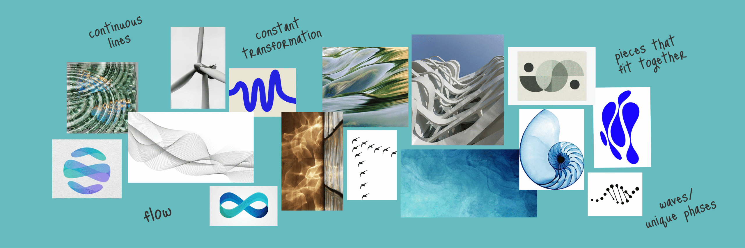
Moodboard
Moodboard
Fluït is a division of a consultancy dedicated to continuous improvement for corporations, inspired by the fluidity of water and the concept of flow. It aims to break away from rigid, traditional corporate images.
As an essential part of our research process, I aimed to convey the atmosphere, tone, and aesthetic direction for this project, using the following visual composition to define Fluit’s emotional and visual map:
I.Reseach
II.Concept
III.Exploration
IV.Outcome
Concept Overview
Core Idea
Naming
Visual Direction
Personality
Core Idea
A dynamic, adaptable brand that represents the natural flow of processes, technological innovation, and continuous improvement.
Naming
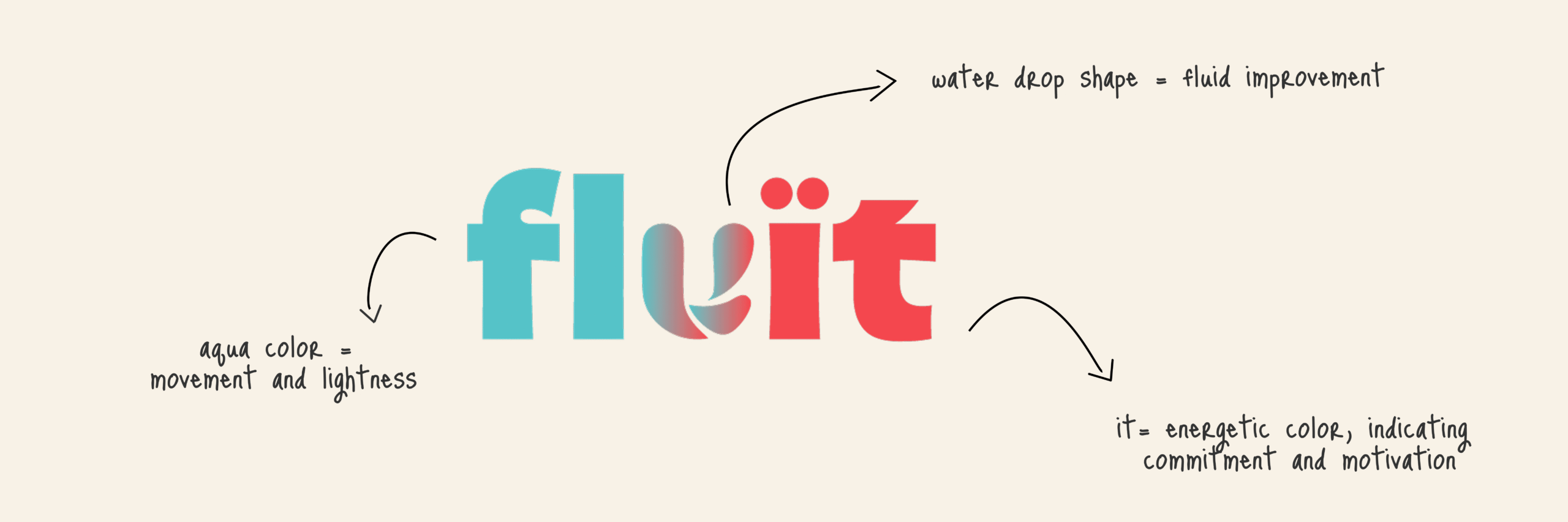
“Fluït” with an open i, referencing Valencian language and the brand’s local roots.
Evokes movement, evolution, and flexibility.
Visual Direction
Fresh, energetic palette (turquoise and coral) to break away from the rigid IT aesthetic.
Dark and light tones to balance contrast and warmth.
Exclusively illustrated imagery, all tied to the concept of continuous improvement.
Personality
Decisive yet approachable. Modern, human, and constantly evolving.
I.Reseach
II.Concept
III.Exploration
IV.Outcome
Exploration
Overview
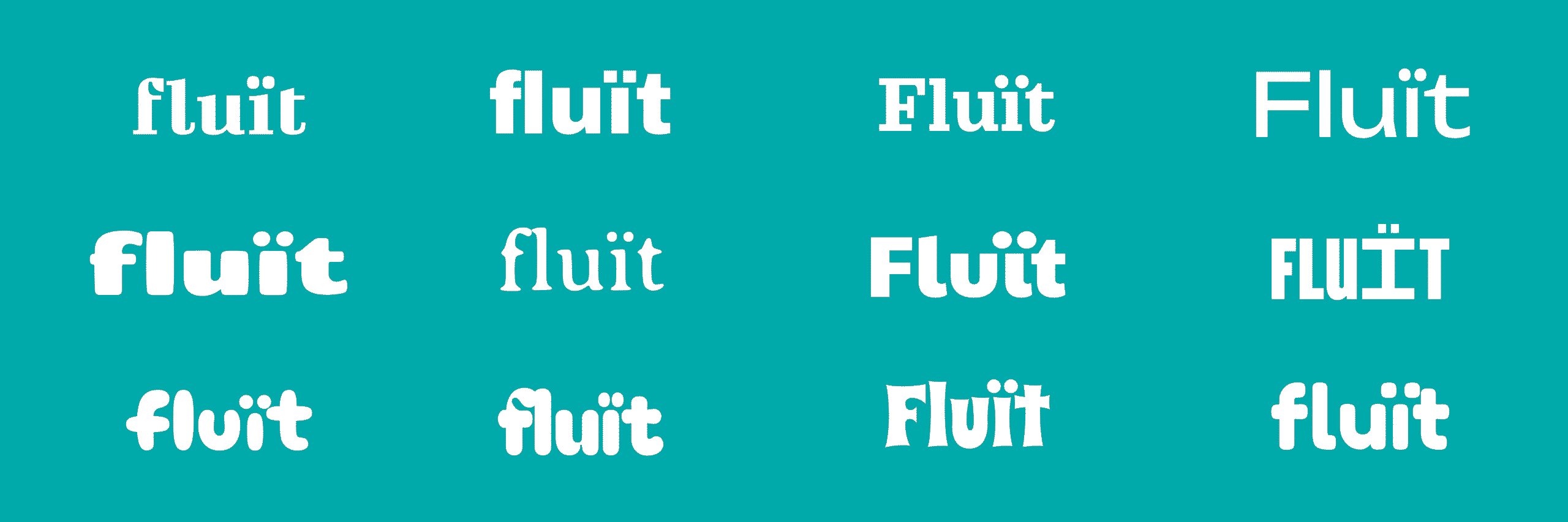
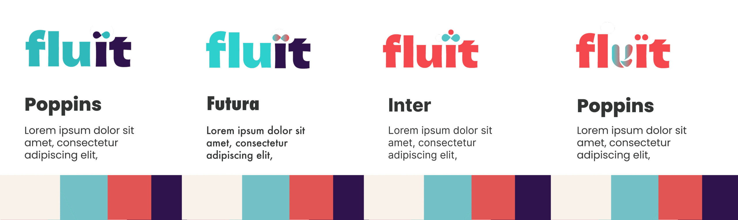
Design Variations
Design Variations
To develop Fluit’s visual identity, I began with extensive typographic exploration, experimenting with different letterforms and weights to find a style that conveyed the brand’s friendly and contemporary character.
I then tested color combinations to balance vibrancy with readability, creating a palette that felt both dynamic and approachable. These visual experiments evolved into a series of logo proposals, refining shapes, proportions, and details until arriving at a design that captured the brand’s essence and adaptability.
I.Reseach
II.Concept
III.Exploration
IV.Outcome
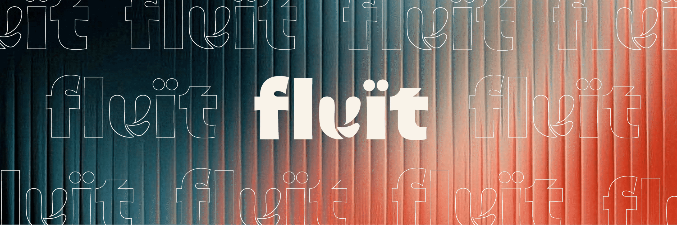
Outcome Overview
Typography
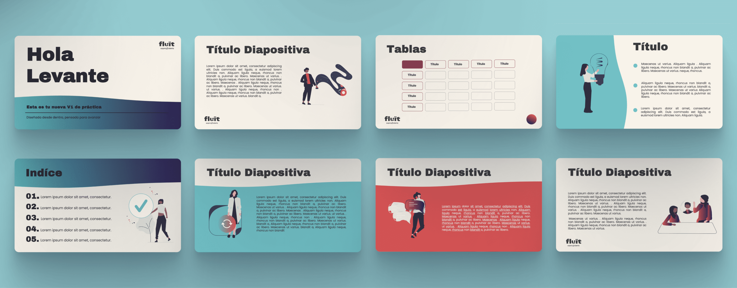
Branding Material
Typography
Logo with rounded shapes, inspired by the fluidity of water.
Archivo Black for strength and presence in headlines.
Poppins for legibility, versatility, and digital coherence.
Branding Marerial
The project resulted in a cohesive visual identity system that is both distinctive and highly functional. The design language—rooted in bold typography, dynamic color gradients, and versatile layouts—was developed to be instantly recognizable while adaptable across multiple formats. Deliverables included a refreshed brand mark, a flexible presentation template system, and a consistent set of visual assets tailored for both internal and external communications.
From a design standpoint, the outcome showcases my ability to:
Translate brand strategy into a tangible visual system that aligns with organizational goals.
Balance aesthetics and usability through layouts optimized for clarity, accessibility, and engagement.
Manage end-to-end design delivery, from concept development to polished,production-ready assets.
The resulting toolkit empowers the client to communicate with clarity, confidence, and a visual presence that reflects their forward-thinking identity.
No posts were found for provided query parameters.