

Airbus
Iterating Features within a Complex Design System — Airbus
Overview
Role:
UX UI Design
Timeline:
16 weeks -80+ hours
Client:
Airbus
Tools used:
Figma
Context
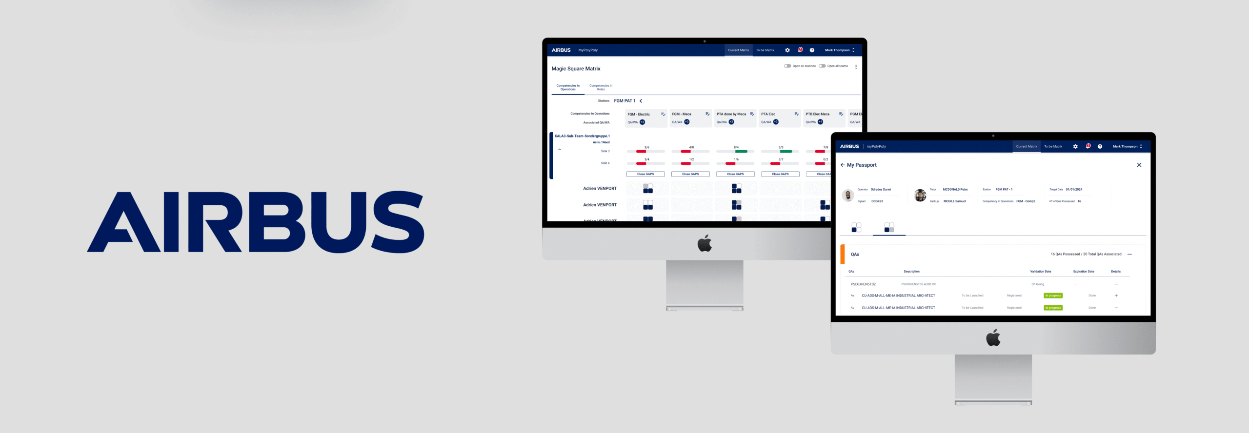
Airbus operates with a robust and well-established corporate design system. As a UX/UI designer, I joined a multidisciplinary team to work on MyPolyPoly, an application within Airbus’ Manufacturing Operations Management (MOM) ecosystem, which supports the monitoring, validation, and traceability of manufacturing processes for aircraft components.
My role involved designing new functionalities within a highly structured environment, reusing existing design elements and patterns to ensure consistency. While the visual language was predefined, the challenge was to deliver user-friendly solutions for complex, highly regulated workflows—always aligning with business needs and technical constraints.
Task
- Applied Airbus’ design system to maintain visual and functional consistency;
- Created UI flows and modals for new features based on stakeholder requests;
- Worked directly with P.O.s to translate technical requirements into user-friendly solutions;
- Delivered fast, accurate design implementations within a high-constraint environment.
Process
I.Empathize
II.Define
III. Ideate
IV. Results
Empathize
Overview
Research
Research
When I joined the project, the client already had a good understanding of their target users, but the information was spread across multiple sources and not fully structured for design decision-making. My first steps were to quickly absorb this existing knowledge and translate it into actionable insights that would inform UX decisions without delaying development.
To achieve this, I structured the research into the following phases:
- Reviewed internal documentation on MOM and MyPolyPoly;
- Conducted direct conversations with Product Owners to understand the platform’s purpose and user-specific needs.
I.Empathize
II.Define
III. Ideate
IV. Results
Define
Overview
Persona
Problem Statements
Persona
Based on consolidated information, I created functional profiles describing the main user groups and their needs. End Users of MyPolyPoly:
- Production Line Operators – Record activities, access work instructions, and track tasks.
- Production Supervisors / Floor Managers – Monitor production status and manage resources.
- Quality Engineers – Perform inspections, record nonconformities, and manage corrective actions.
- Production Planners – Create and adjust schedules, optimize sequences, and control inventory.
- Maintenance Staff – Use data to plan preventive and predictive maintenance.
- Supply Chain Managers – Track material consumption and logistics flow.
- HR / Training Teams – Monitor skills, training, and competency gaps.
Problems Statements
Throughout my work on MyPolyPoly, I handled a variety of requests from Product Owners. These tasks were always focused on implementing new actions or interactions within existing screens, with the goal of improving efficiency and agility for operators in complex assembly lines.
Due to the nature of the platform and the sensitivity of production data, I’ve selected one of the simplest cases to illustrate the type of work I delivered.
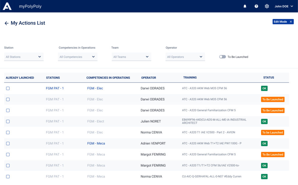
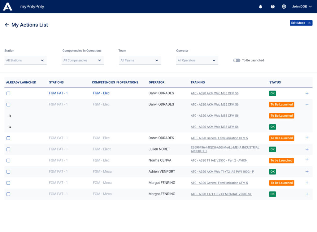
The specific example below involved enhancing table interactions to provide quick access to contextual details. The Product Owner requested a solution that would allow users to view more detailed information related to each row in a data table—without navigating away from the main interface. In addition, users needed the ability to click through to a dedicated page for full details when necessary.
I.Empathize
II.Define
III. Ideate
IV. Results
Ideate
Overview
Ideation
Ideation
To address the requirement of linking each expandable item to a detailed page, I explored two different visual approaches using components allowed within the Airbus design system:
- Underlined Text Approach: The additional information shown in the expandable row was underlined, following a conventional web pattern to suggest clickability and navigation. This was the most minimal and text-driven solution, preserving visual cleanliness and aligning with accessibility conventions;
- Icon-Based Approach: I tested a second variation using a small external link icon (already available in the system) placed before each piece of information, reinforcing the idea that clicking would lead to another page. This provided stronger visual affordance but added slightly more visual noise;
I.Empathize
II.Define
III. Ideate
IV. Results
Results
Overview
Final Design
Considerations
Feedback
Final Design
After presenting both options to the Product Owner and development team:
- The underlined text version was chosen for its clarity, simplicity, and lighter visual weight;
- We agreed that the underlining was sufficient to communicate interaction, especially when combined with hover feedback and cursor change;
- This process reinforced the importance of microinteractions and visual cues in communicating navigation without overwhelming the interface.
Considerations
- Lack of consolidated user insights
Although the audience for MyPolyPoly was already defined, information about their specific workflows, pain points, and priorities was scattered across different teams, making it difficult to design tailored solutions efficiently. - Fragmented visual consistency
Previous screens had been developed by multiple contributors without strict adherence to Airbus’ design system, leading to inconsistencies in look, feel, and interaction patterns. - Complex technical requirements
Stakeholder requests were often framed in highly technical language, making it challenging to translate them directly into intuitive user experiences without additional clarification and iteration. - High delivery pressure
The project operated under tight timelines and strict constraints, requiring quick design decisions and minimal research time, while still ensuring accuracy and usability.

Feedback
Reduced workflow friction: Users no longer needed to leave the table to access supporting information;
Increased efficiency: Quick access to detail-level content improved decision-making for technicians and operators;
Scalable pattern: The expandable row structure was later reused in other modules with similar UX needs.